A Data-Driven Product Page
Increasing Digital Extremes’ revenue with a data-driven redesign
- My Role
- Senior Product Designer
- Software Used
- FigmaAdobe Photoshop
- Team
- 2 Product Designers2 Web Developers1 Producer2 Data Scientists1 Project Manager
Context
Warframe is a video game created by Digital Extremes. The game is free to play but players can choose to purchase cosmetic bundles through its website. These bundles will often have 2-5 different packs of content with varying prices. To add another level of complexity, some packs can be purchased with money, some can be purchased with Warframe’s premium currency (platinum), and some can be purchased with both. If a pack is purchased with real money, they’ll receive platinum with their purchase.
Problem Space
Not Designed For Our Audience
Warframe’s current product pages have not been designed with our audience’s needs and expectations in mind.
Difficult To Navigate
The way Warframe currently displays the multiple purchase options make it difficult for users to discover and navigate between different products.
No Standardization
The purchasing experience across Warframe’s website isn’t standardized which makes it difficult to test and measure our product page’s performance.
“If I knew I could have purchased this pack with platinum, I would have.”
Problem Discovery
Let’s take a look at why they may not have known they could have purchased their pack with platinum.
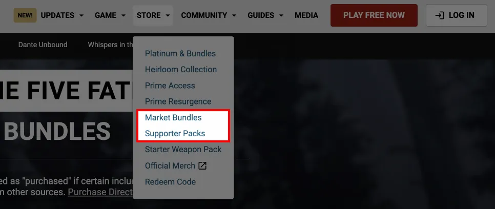
Different payment options for the same packs are organized on completely different pages. These pages are titled “Market Bundles” and “Supporter Packs”, both of which don’t really describe what they are and how they relate to each other. That makes it really difficult and time consuming to compare payment options.
Defining The Audience
Before we can conduct an accurate audit of the product pages themselves, we need to define the audience we’re designing for so we can better understand their needs and behaviours.
Purchase-Ready Users
These users have already decided they want to purchase the pack before they visit the product page. They don’t need to be further convinced. The best way to serve these users is by giving them the fastest and most simple path to make the purchase.
Researchers
These users have not been convinced to purchase a product yet. They’ll want to compare different packs, pricing, and do their homework before they decide if they want to buy something. The best way to serve these users is by making it easy to compare and view each product’s value proposition.
Research
Auditing the product page revealed a lot of areas of improvement but an overall summary of the findings include:
- Each pack lives within a carousel which makes pack discovery difficult. Based on our user data, the majority of our users don’t interact with carousels at all.
- It’s difficult to compare packs as it takes a lot of page navigation back and forth to compare pricing and pack items.
- The “BUY NOW” CTA should stand out and draw the most attention on the screen but its button colour is modified to match the pack key art. This makes the button blend into the imagery behind it.
- The website’s content and layout break significantly on tablet and mobile sizes.
- The UI/UX design of the page could be modernized and improved.
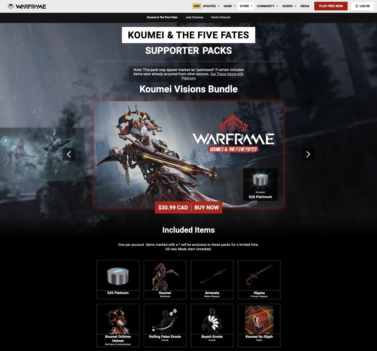
I connected with internal and external stakeholders to discuss redesigning our website’s product pages. Through this conversation, we decided we’ll apply this new redesigned product page to all of Warframe’s products in an effort to standardize our purchasing experience. That way we’ll be able to more easily track the performance of each page. Speaking with our data scientists, I learnt that we want to prioritize real money purchases over platinum purchases.
Solution Space
We’ll conduct an A/B test between the current product page and the proposed redesigned product page. We’ll be measuring the conversion rate, revenue per user, and the amount of customer support tickets we receive for this page.
Leverage User Data
Redesign the product page to serve our defined audience.
Solves: Not designed for our audience
Consolidate It
Consolidate and simplify our product page offerings and payment options.
Solves: Difficult to navigate
Standardize It
Design a product page template that can accommodate all of our products. This will be the standardized design for Digital Extremes’ product pages.
Solves: No standardization
Competitive Analysis
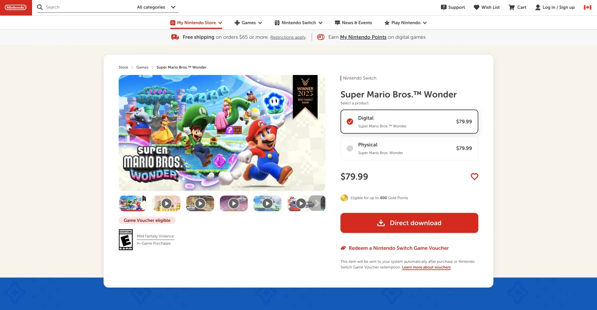
I conducted a competitive analysis on companies inside and outside of the gaming industry to learn how their product pages are designed and how they’ve solved similar problems.
One of the most common layouts I’ve seen on product pages is similar to this one on Nintendo’s website. The “pack selector” is on the right and the pack contents are on the left. This is an important observation because leaning into a user’s familiarity is effective within a purchasing flow.
Page Layout Explorations
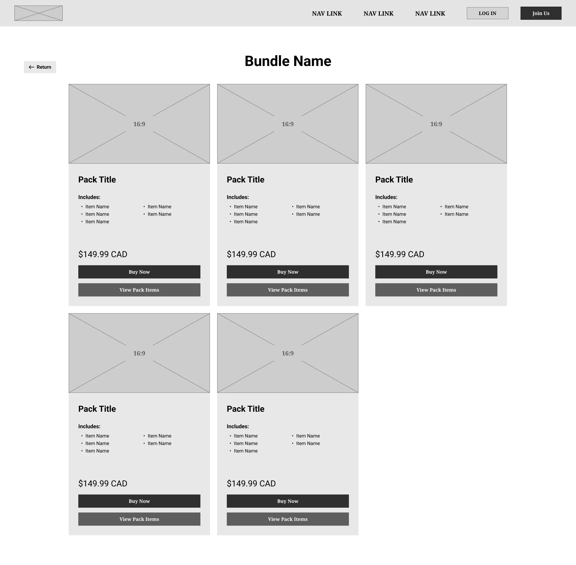
Page Layout Exploration #1
Advantages
- Each pack is easily comparable at a glance.
Disadvantages
- There isn’t enough space to show the value proposition of each page. The value proposition of each item is how it looks so having the key art and item images as large as possible is important.
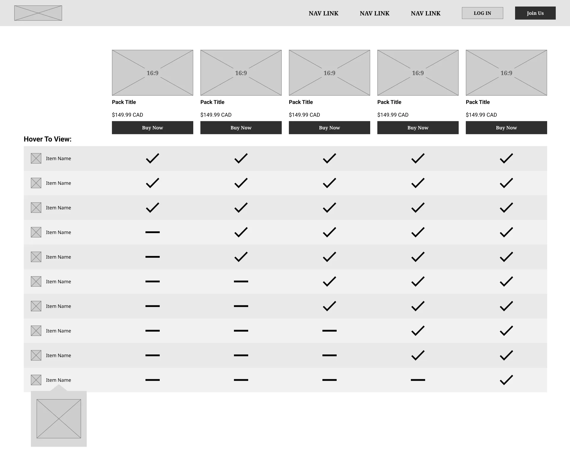
Page Layout Exploration #2
Advantages
- This layout is very common on other video game product pages so it leans into familiarity for the user.
Disadvantages
- Doesn’t fit how our bundles are structured as they offer completely different items instead of being incremental upgrades from each other.
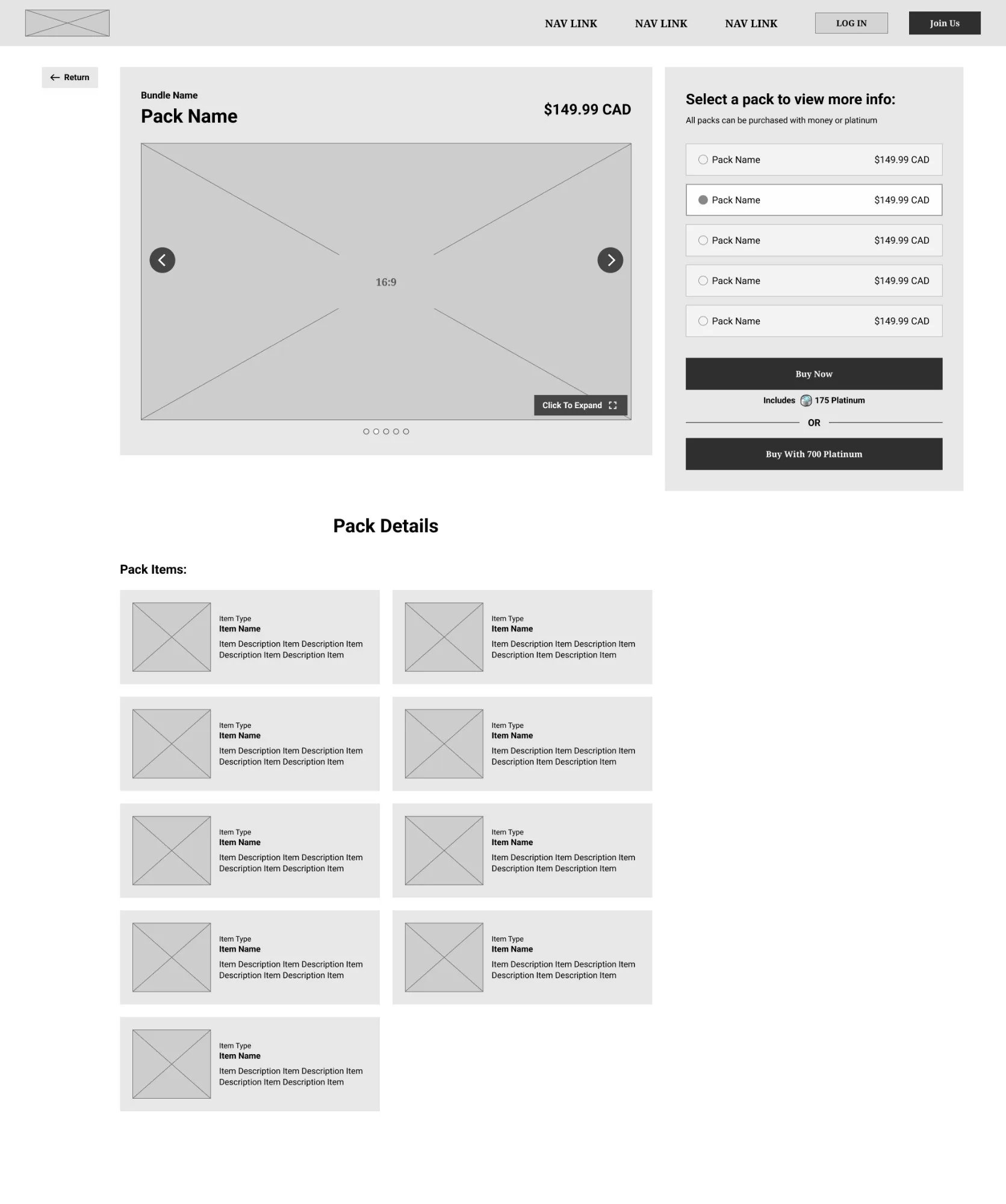
Page Layout Final Wireframes
Advantages
- The value proposition of each pack is large and clear.
- Fits how our product bundles are structured.
- This layout is very common on other website product pages so it leans into familiarity for the user.
- Each pack pricing is always on the screen which allows users to constantly evaluate which pack is best for them.
Pack Selector
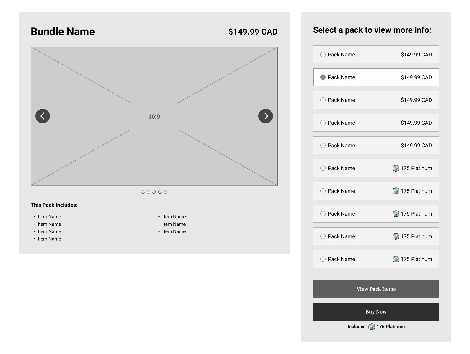
Pack Selector Exploration #1
Advantages
- Shows every pack available within the bundle.
Disadvantages
- Doesn’t clearly illustrate how some packs include the same items but have different purchase options.
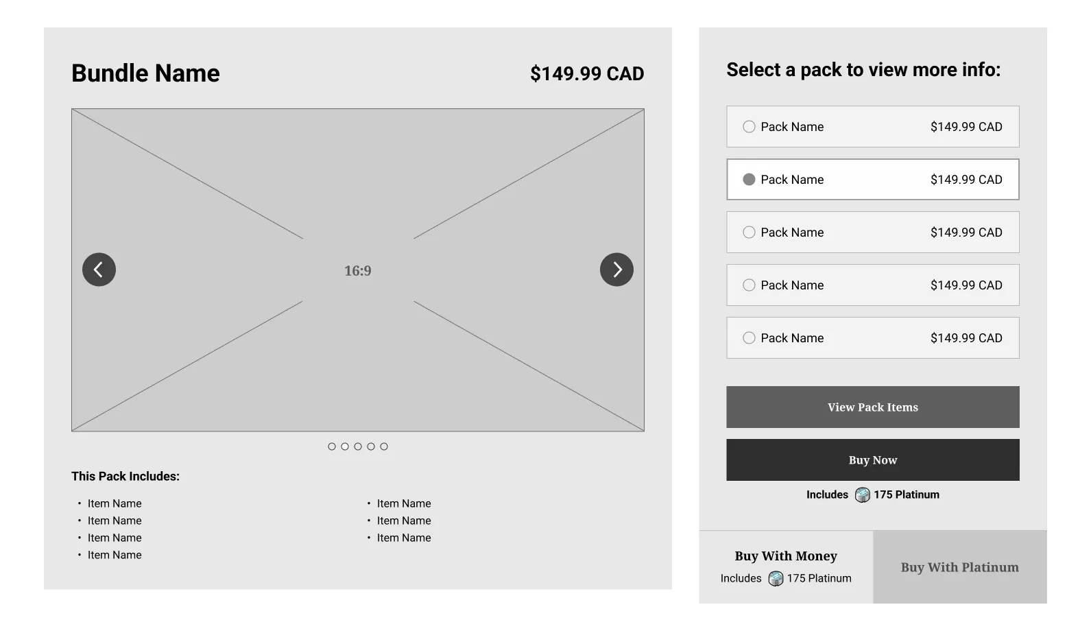
Pack Selector Exploration #2
Advantages
- More concise and clear.
- Gives the user control over which content to compare as they can tab between platinum packs and real money packs.
Disadvantages
- Pack discovery isn’t ideal as it can hide certain packs behind a click if the bundle includes packs that can only be purchased with platinum.
- Pack comparison isn’t ideal as it requires a lot of interactions to navigate between different packs and payment methods.
- This design doesn’t serve the Purchase-Ready users because finding the pack they want to purchase may take more time if it’s purchased with platinum.
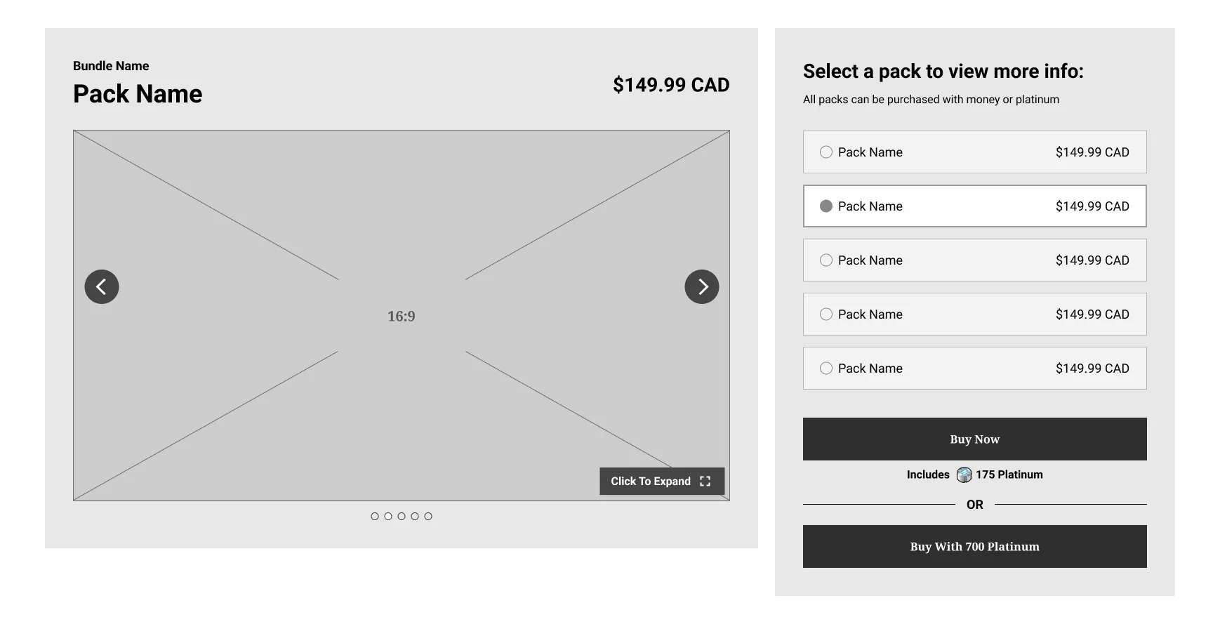
Pack Selector Final Wireframes
Advantages
- Packs purchased with real money are prioritized as each pack is listed with their real money price. If a pack can only be purchased with platinum, it will display its platinum price instead.
- If a pack can be purchased with either payment option, the user will be shown two primary buttons to add positive friction. This allows the user to decide between paying with real money or platinum.
- This design serves the Purchase-Ready Users as the purchase CTA is very easy to find and always on the screen.
- This design serves Researchers because it allows them to easily compare product content, pricing, and payment methods.
Final Designs
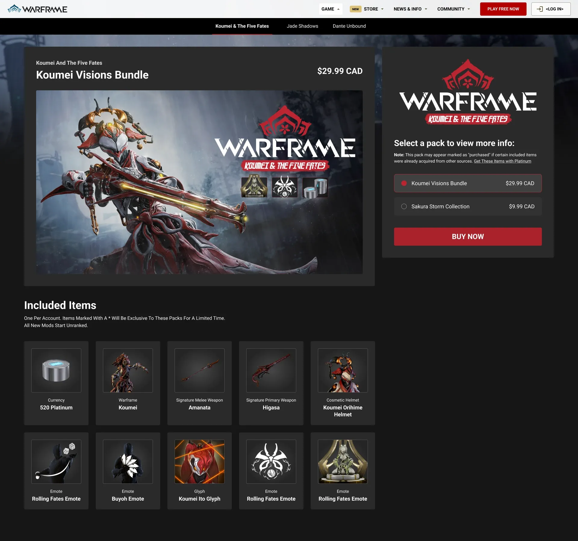
Before starting the final designs, I met with the project’s lead data scientist to confirm whether or not this final design was acceptable for an A/B test. He recommended removing all of the new features as well as the platinum packs from the design. This change allows us to conduct a more accurate A/B test by first testing the layout only.
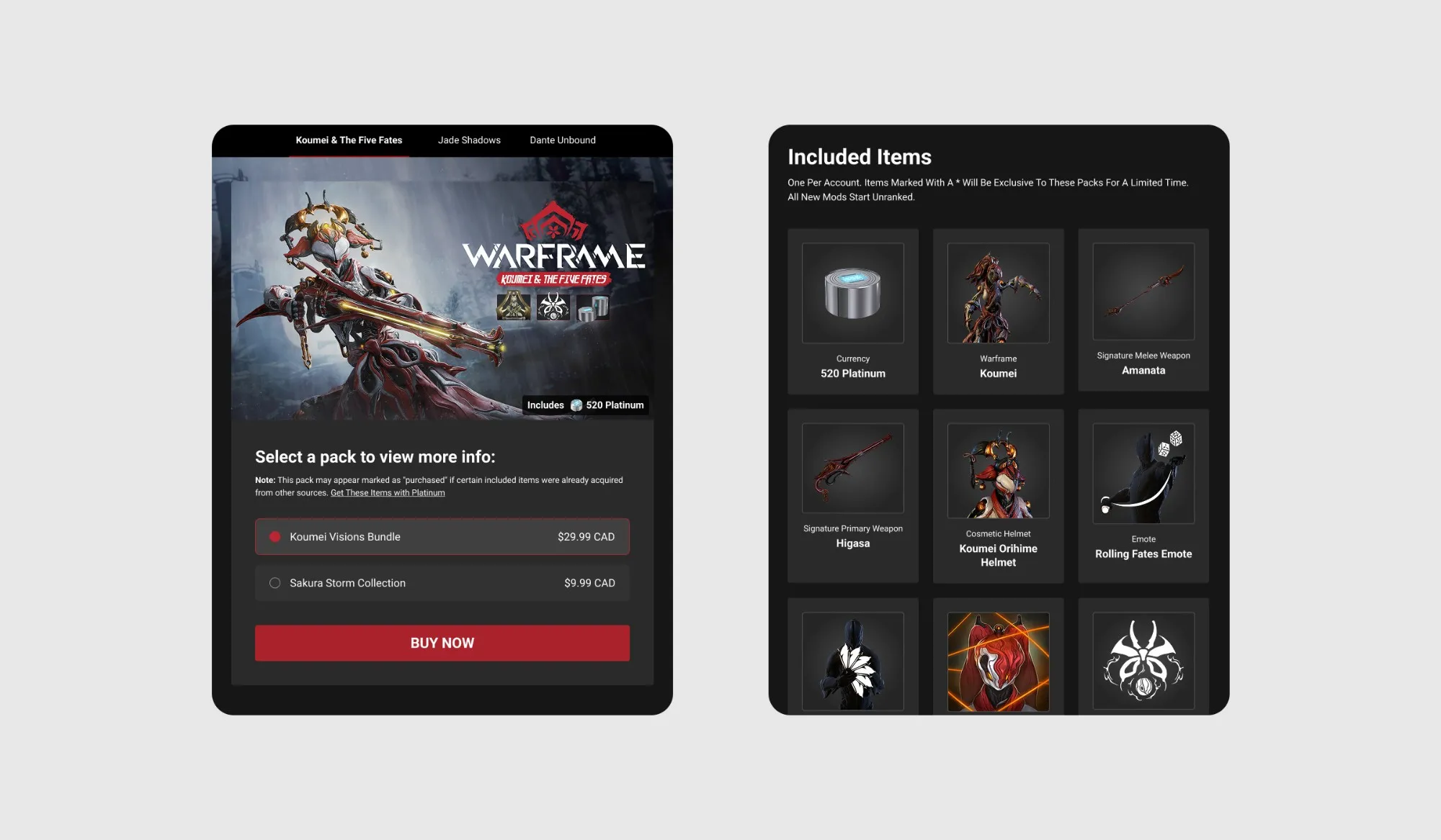
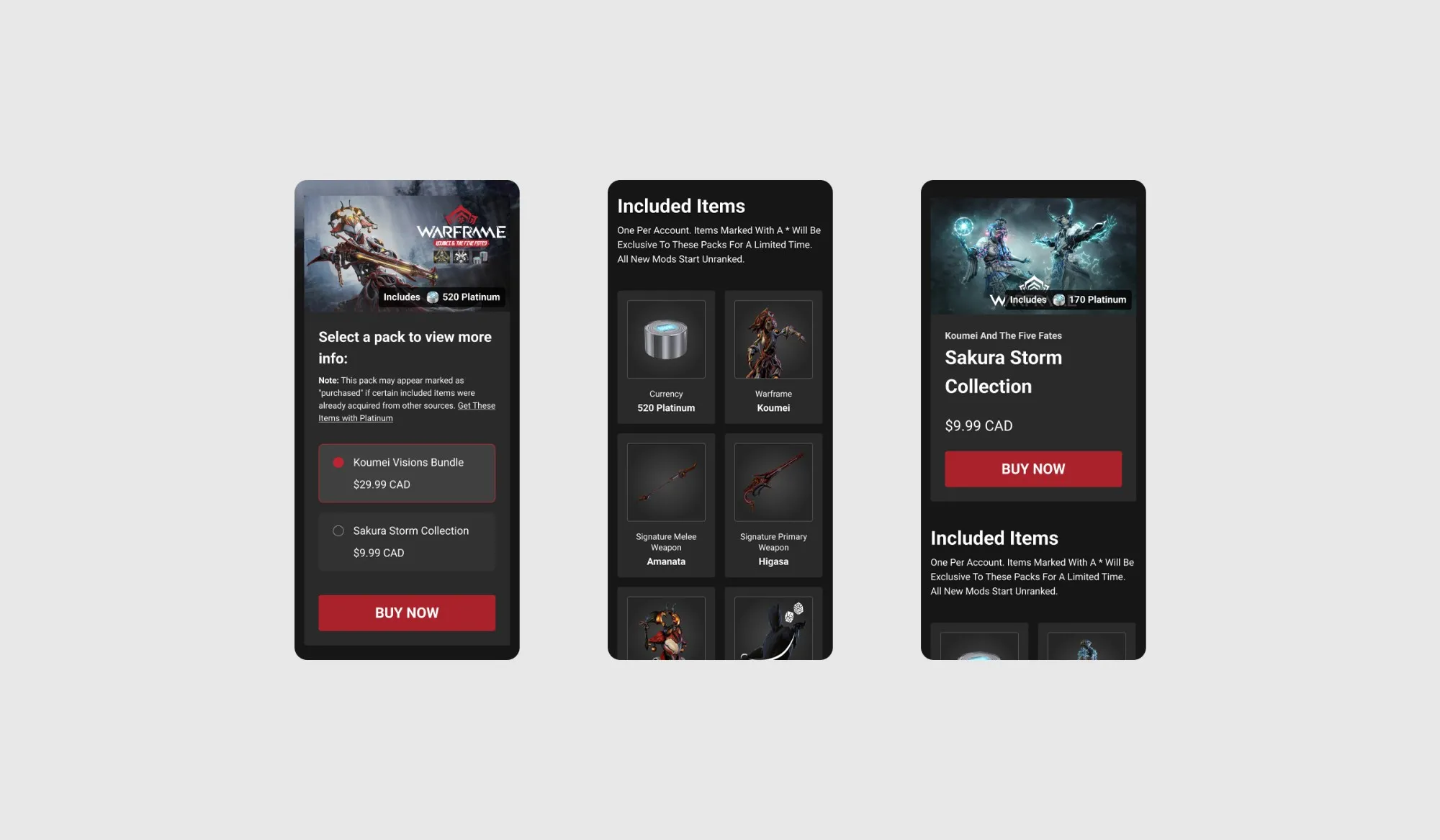
I created the final designs for Warframe’s product pages. This included designs for ultrawide, desktop, tablet, and mobile sizes as well as any necessary prototypes and success / fail states. I also assisted in maintaining visual consistency and good UX practices by collaborating with the engineering team during the QA process of the fully developed flow.
Results
2% Higher Conversion Rate
Our A/B test determined that this new design resulted in a 2% higher conversion rate. Since more users are now making purchases, this will increase Digital Extremes’ revenue across all of our website’s products.
Site-Wide Implementation
Since our A/B test concluded that this new product page design performs better, we’ve implemented this design to the rest of Warframe’s product pages. This allows the purchasing experience on Warframe to be standardized and we’re now able to test the performance of each page and A/B test more accurately.
Next Steps
To further improve our product pages and make it easier for users to navigate between different packs and payment options, we’ll be A/B testing the designs that include different payment options. After this, we’ll be running more tests that include our wish list of features such as larger items carousels, item descriptions, and much more.